Unlocking the Power of Scientific Visualization: A Comprehensive List of 2023 Illustrations & Animations
Scientific visualization can transform complex data and concepts into accessible, meaningful narratives. We’re highlighting 10 of our favorite 2023 creations that have pushed the boundaries of visual storytelling for scientific research. In doing so, we revisit the fascinating breakthroughs of the incredible scientists and engineers we worked with. We are welcoming 2024 with a showcase of the exceptional science and technology that our dedicated SayoStudio team visualized throughout 2023.
First, you’ll read about the memristor chip developed by neural engineers at George Washington University. Then, we look at cutting-edge genomics for human biology and later, genetic studies of coral reef ecology. Finally, we end with the exciting cross-over from basic research to industry and look at De-Ice’s new technology to safely de-ice planes. Thank you for joining us to review our 10 best science images, including captivating animations, illustrations, and digital design created by our diverse team of scientific communicators. Enjoy!
1. Memristor Chip Conceptual Illustration—George Washington University

Drawing inspiration from the human brain, GWU engineers are spearheading a revolution in computer chip technology. SayoStudio’s brain-computer-chip art was the feature image for GW’s research magazine, to draw people in to learn more about the emerging technology. We collaborated with the GW communications department and computer engineer Dr. Gina Adam to accurately convey their computing technology. Our conceptual scientific illustration evokes neural inspiration, while the accompanying animation explains the similarities between a human neuron and a memristor. Their groundbreaking memristor chip enables machine learning by recording electrical pulses and encouraging these same pathways in the future, similar to how our brains record memories. The medical engineering animation portrays how ions physically rearrange, emulating the processes observed in our synapses. You can see the science art in context with the full animation in GW’s Research Magazine.
2. Scientific Visualization for the UCSC PanGenome: An Animation
UCSC Pangenome Animation from SayoStudio from SayoStudio on Vimeo.
UCSC released the human pangenome, a monumental undertaking on par with the release of the human genome. The wealth of knowledge unleashed with the Human Genome in 2009 has brought so many breakthroughs to our understanding of biology and health. Unfortunately, these advances have been based on ONE person’s genome. As you can imagine, this leads to a great deal of bias when defining what is “normal”. The Human Pangenome is working to correct this, with genomes from 47 people across the world. This library of genetics will revolutionize the way we use genomics to develop medical treatments. Sarah Talbot for SayoStudio envisioned this modern, science story-telling animation to explain the significance of this research milestone that brings well-needed representation to understanding the human genome.
3. Tempe Well—Water Treatment Visualization
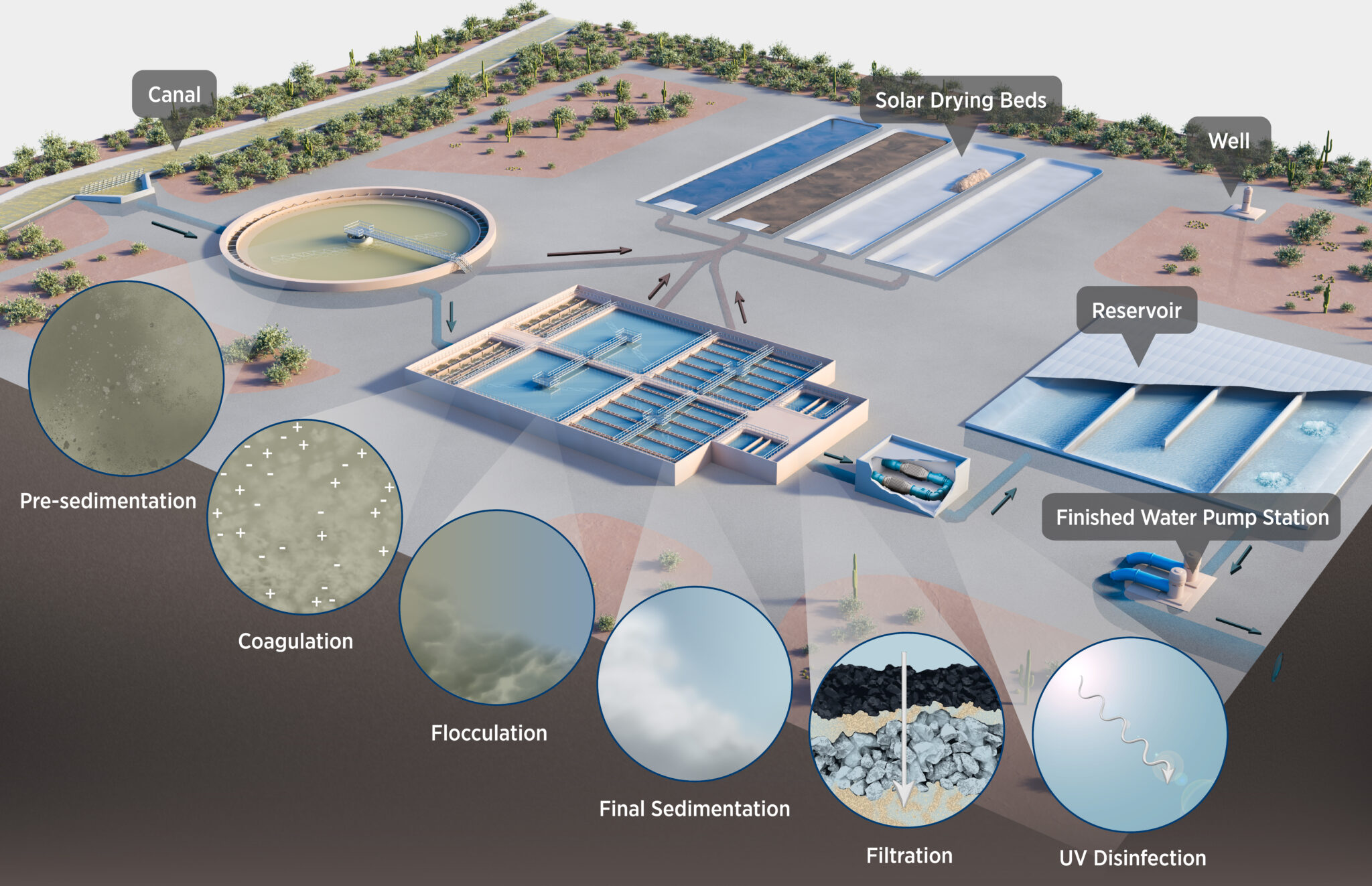
We often don’t think of the vast engineering and infrastructure needed to bring us fresh drinking water. The City of Tempe, Arizona approached us seeking assistance to educate the public about the complex processes that treat surface water. We illustrated the inner workings of Tempe’s surface water treatment plants to show the many steps involved. As water enters the plants from rivers, reservoirs, canals, and wells, it flows through a series of pools and filters to remove solids, to disinfect, and to purify.
4. Space-Time Duality Illustration and Animated GIF for Google Quantum AI
 Quantum computing is in its nascent stages, with Google Quantum leading the way. We developed an abstract representation of quantum computing for Pedram Roushan’s Google Quantum AI research group. Taking inspiration from a brainstorming session with Dr. Roushan, the illustration evokes M.C. Escher’s art. This project encompassed a novel mathematical proof demonstrating that quantum circuits can efficiently tackle the most challenging problems while maintaining minimal error margins. Art by Melanie Lee and animation by Sarah Talbot, SayoStudio.
5. Sustainable Conservation—Soil Health Visualization
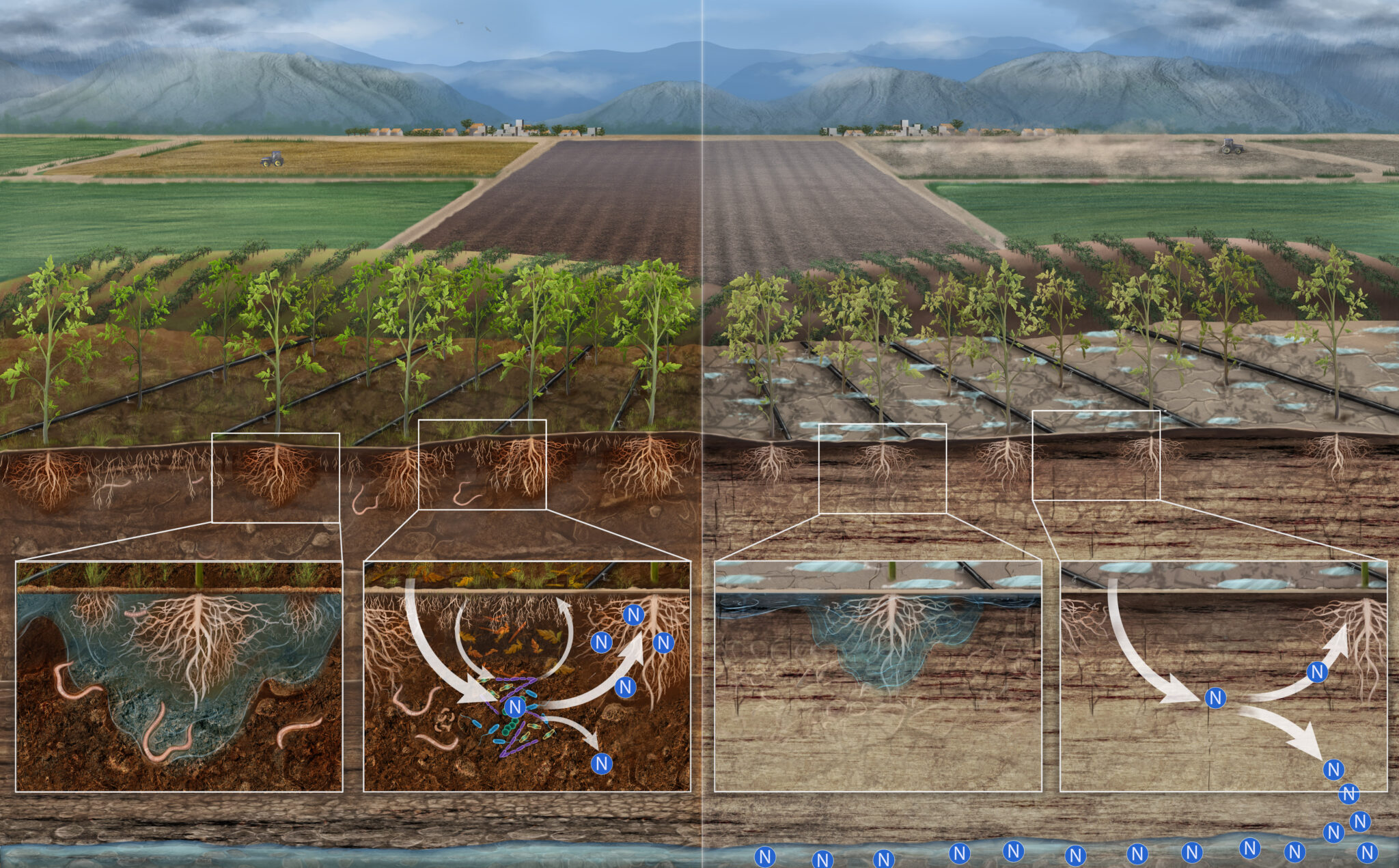
In thriving soil ecosystems that have ample organic material, resilient root systems and beneficial microorganisms are essential to efficient nitrogen cycling. Conversely, in degraded soil, more and more artificial fertilizers are added in an attempt to compensate for the excessive groundwater leaching. Unfortunately, the excess of nitrogen ultimately reaches our lakes and rivers causing unwanted algae blooms. Sustainable Conservation works with farmers to modify their practices for better yields, financial savings, and improved environmental impacts. We illustrated how sustainable practices can improve soil health, for Sustainable Conservation to share with its members and agricultural partners.
6. New Mexico Water Data Convergence Graphic Design
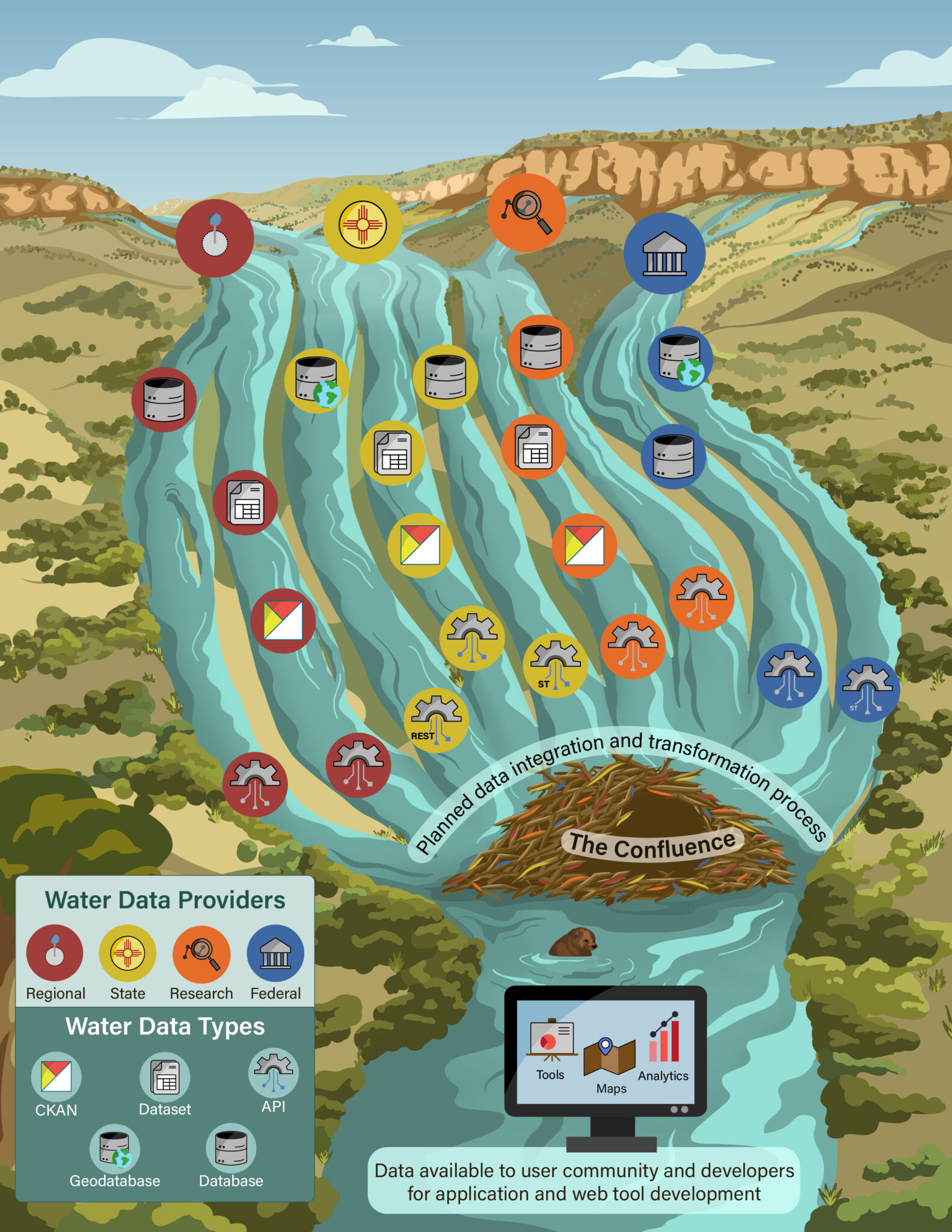
This SayoStudio data stream graphic, created for the New Mexico Bureau of Geology and Mineral Resources, depicts the convergence of water data from several sources into one public database. The Water Data Integration system synthesizes information from numerous government and academic partners into one comprehensive water database. In turn, the data will be available to the user community and developers for application and web tool development. We used the New Mexico landscape and hydrogeological water convergence features to create this conceptual illustration of their impressive data synthesis.
7. Science News Cover Art—Neutrino Imaging Fossil Visualization
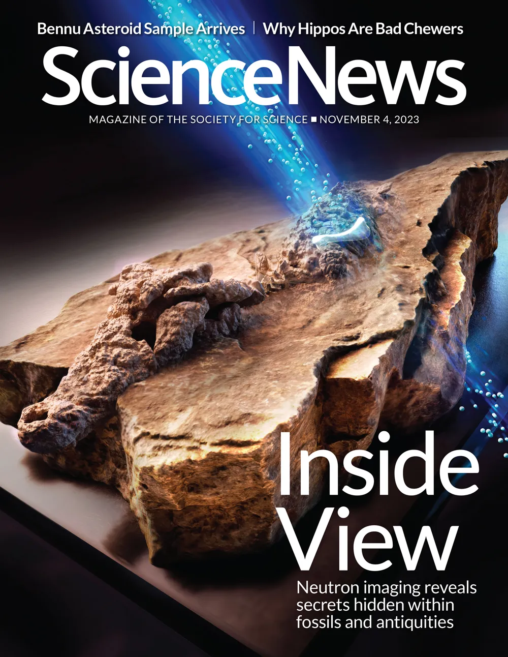
Our long-time client Science News reached out to SayoStudio to create a 3D visualization of the extinct crocodilian Confractosuchus for the issue’s cover art on neutron imaging. The Science News issue describes a new scientific visualization method called neutron imaging that can reveal interior details without damaging fragile specimens. Using 3D software and hand-drawing techniques, SayoStudio depicted a neutron stream revealing a small fossilized dinosaur bone. The bone was embedded in the crocodilian’s stomach—an undigested dinner. Neutron imaging has also been used to visualize other artifacts, like an ancient Chinese ax and mummies. This groundbreaking technology (pun intended) represents a significant step forward to preserve and understand ancient artifacts, and safeguard these invaluable specimens from potential damage or destruction during the investigative process.
8. Viral Vectors Animation—Visualizing the Science of Gene Therapy
Gene Therapy: Viral Vectors from SayoStudio on Vimeo.
Gene therapies are developed to treat or cure genetic diseases and work by several mechanisms. One of the most effective delivery vehicles is a therapy using viral vectors. Our 2D animation, crafted for The Foundation of Cell and Gene Medicine, describes how viral vectors work in gene therapy. A critical step in the development of life-saving gene therapies, this animation serves to educate the audience with a fundamental understanding of how genes are transferred into cells. Created by Christine Shan, SayoStudio.
9. Visualizing Coral Gene Flow—an Illustrated Research Figure
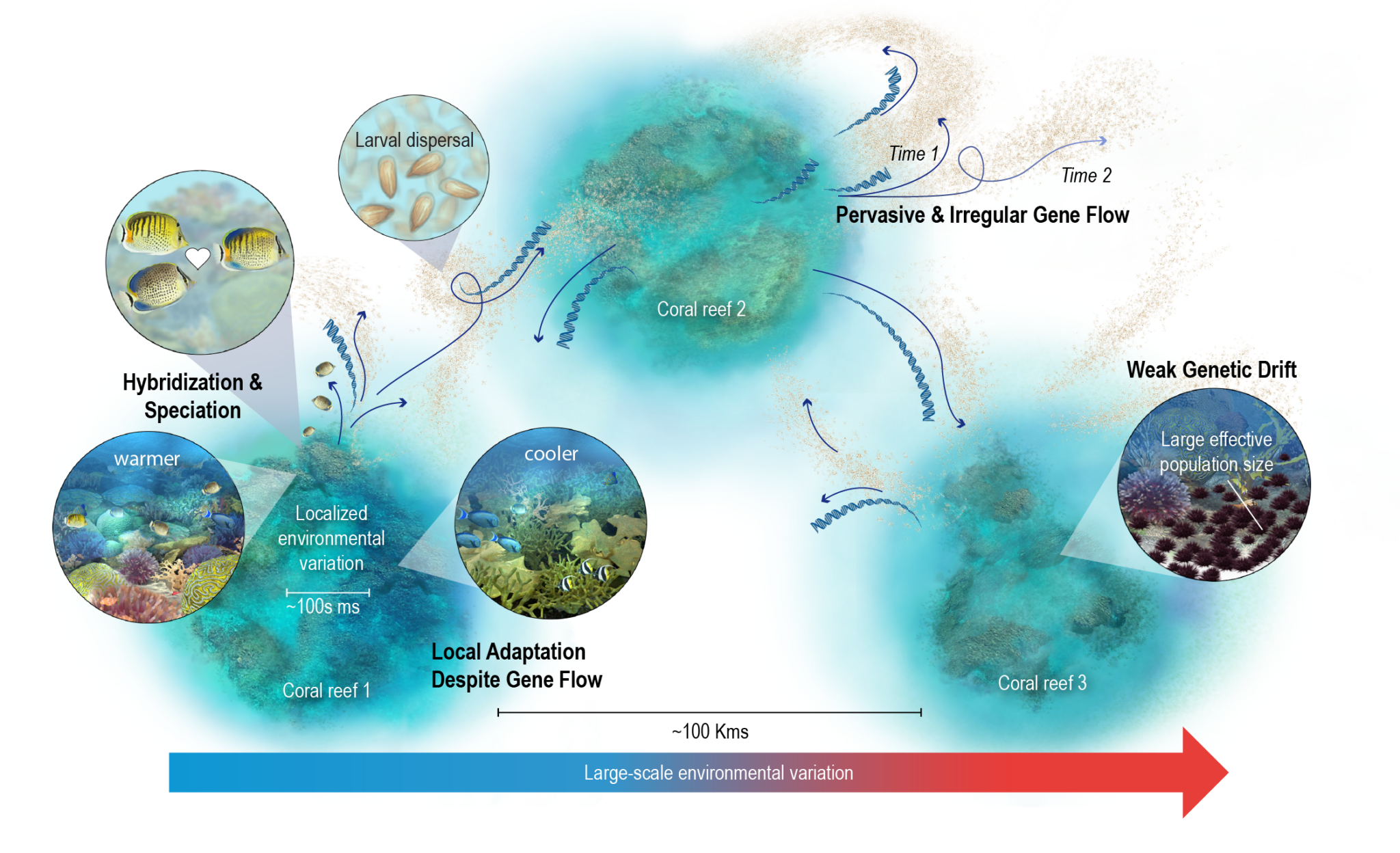
Sadly, most of us know of coral bleaching and dying reefs, but how will climate change impact reefs globally? Our illustration for Dr. Malin Pinsky’s Review article, “Coral Reef Population Genomics in an Age of Global Change”, shows the many nuances to consider when predicting the widespread impact across our oceans. Coral reef genetic dynamics are influenced by localized environmental differences, gene flow from one population to another, and species hybridization. As our global temperatures rise, all of these details need to be considered to predict both adaptation and extinctions. We were thrilled to collaborate on this project to represent the Pinsky Lab’s research on microevolution.
10. De-Ice Technical Animation
Do you know the largest cause of air traffic delay in the National Airspace System? That’s right, it’s weather. During the winter months, fog, snow, and ice result in poor visibility and conditions that make it impossible to safely fly. Currently, deicing relies on applying environmentally toxic glycol-based chemicals directly onto the aircraft. Not only is this a toxic chemical, but airplanes must return to the gate, leading to long delays. Our animation for De-Ice showcases their revolutionary deicing technology for airplanes.
De-Ice’s novel deicing technology eliminates the need for these contaminants and the additional time needed for ground deicing before takeoff. The technology can be easily applied to existing aircraft with copper strips applied to the wing of an aircraft. Similar to an induction cooktop, the copper strips receive energy from an electromagnetic field to safely heat the aluminum wing. De-ice recently partnered with Air Canada, so you just might benefit from this eco-friendly deicing solution on your next winter flight. 3d animation and sound by Christoph Kuehne, directed by Claire Agosti and Nicolle Fuller, SayoStudio. Voice-over by Sarah Starling.
It’s a Wrap, 2023 Science Visualizations
Bidding farewell to the remarkable scientific visualization projects of 2023, we’re left inspired by the collaborative journey undertaken by brilliant scientists and our dedicated SayoStudio team. Each animation, illustration, and digital artwork showcased here encompasses our commitment to making intricate scientific concepts comprehensible and engaging for everyone. Looking ahead, we’re eager to continue our work in the scientific visualization field. Stay tuned for more intriguing discoveries and innovative visualizations in the scientific communication realm!

So many projects!!!
Go, Team Sayo!
I love seeing the breadth and depth of your work.